2024
Industry
Real Estate
Company
Ziegert
Status
Shipped
Team
2 Designers, 1 Product Manager, 7 Engineers

Context
In response to market shifts, Ziegert, a 40-year-old German real estate firm, prioritized customer-centricity. Everestate, its digital B2C platform with focus on new buildings target both self-usage buyers as well of investors with different levels of experience.
The German real estate market underwent a significant transformation during the years 2022-2023. Transitioning from a seller's market, characterized by limited supply and favorable conditions for brokers, it evolved into a buyer's market. This shift was influenced by geopolitical uncertainties stemming from the Russian invasion of Ukraine, coupled with rising inflation and interest rates.
In response to this dynamic landscape, Ziegert, a well-established 40-year-old German real estate company, recognized the importance of adopting a customer-centric approach. The company made strategic investments in research and user experience enhancements for its digital B2C real estate sales platform, Everestate.
Everestate specializes in selling newly built or under-development apartments and houses, catering to three distinct customer segments on the buyer's side. Self-usage buyers constitute individuals purchasing properties with the intention of residing in them, often newly married couples planning for a family or older individuals preparing for retirement. Experienced real estate investors, a wealthier segment, are well-versed in calculating investment returns and navigating the nuances of the German market. Lastly, first-time investors are individuals intrigued by real estate investment, having studied the subject but not yet made their inaugural purchase. This strategic segmentation allows Everestate to tailor its services to diverse buyer profiles in the evolving German real estate landscape.


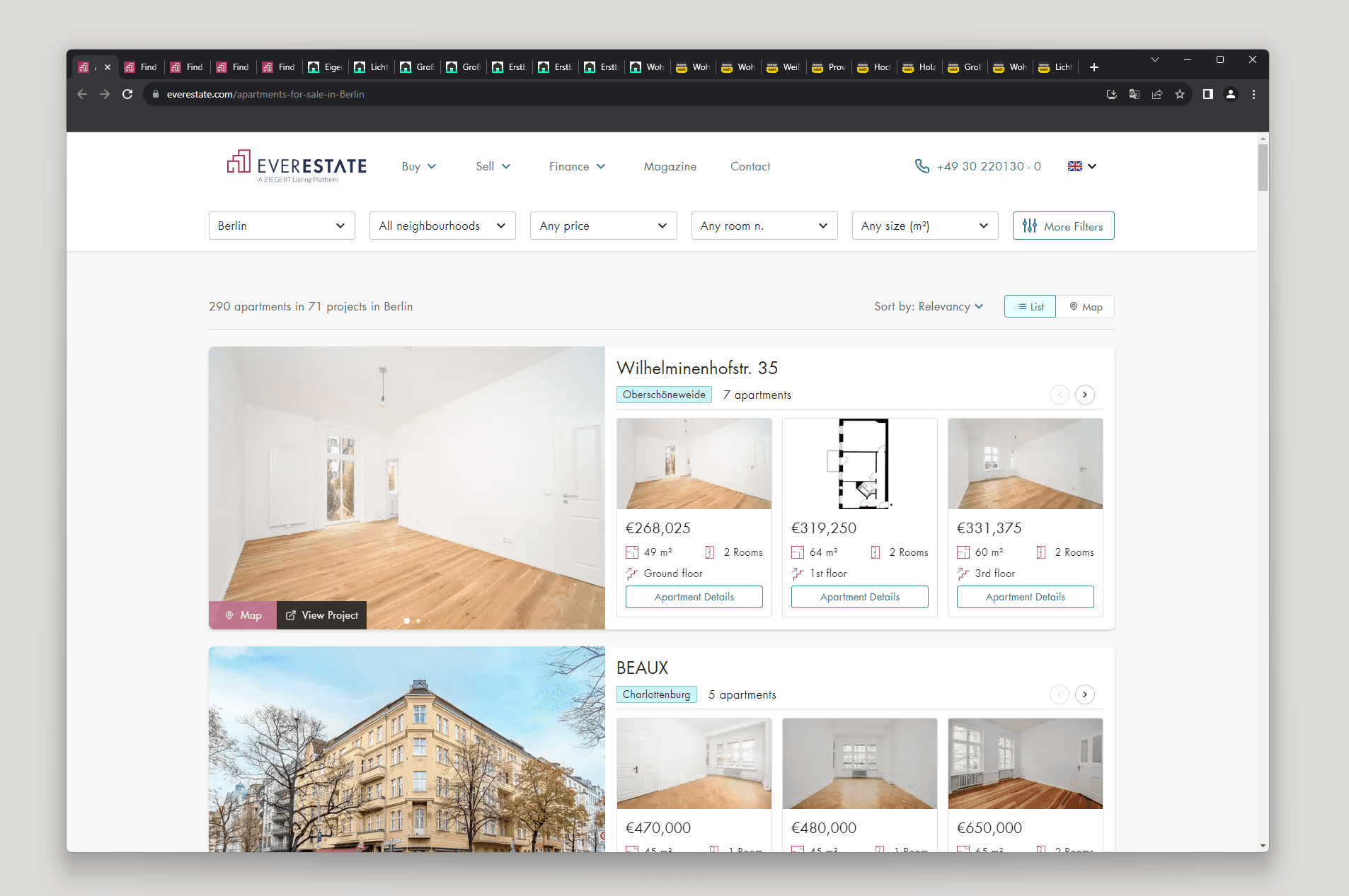
The current userflow from Everestate did not differentiate from other solutions on the market. In an overview, the users goes from home to catalog where they search and filter according to their criteras. In the catalog we show results of both projects (a building with many apartments available) and units (a single apartment). After miticously looking at all information they submit a contact inquiry if the property match their needs.
Because of Everestate focus on new buildings, the Project Page is an important step of the userflow, where we have the opportunity to present a project for the customer. At that time we had two tipes of Project Page, what we called "Default" was the simpler version with minimun information, and the "Branded" was a fully customizable page. Unfourtunally, both pages was underperforming, with a 1,24% conversion from project to unit page.
Both Project Pages was done with legacy code and design components. As we were migrating our platform to a better technology it was a good opportunity to improve the UX, while also aming to better conversion rate.

Problem

How might we make it easier for the users to get the information about the project they are looking for and later choose the perfect apartment for them?
Side goals
Migrate to knew technology (NextJS)
SEO optmization
UX improvements
Increase engagement
Unify branded and default project pages
Success metrics
Increase CR from project to unit page from 1% to 5%
Increase engagement (avg. clicks per session)
Increase project page users in 50% (SEO improvements)
Discovery
The journey begins with insights from user research, combined with data analysis and an investigation into previous design decisions.
As part of the strategy for 2023, we contected to rounds of user research to better understand our customer. The information from this resarch gave insights for this and other projects which I worked throught this year. To complement the reseach, I investigated the data that we had about the use of the project page, and also dig into documentation regarding how the old design decisions were made.


User Research
2 Interview rounds
14 Interviews
3 target groups
When the first reasearch round happened I was working on another B2B project at Ziegert, so when I joined the B2C domain they were just sharing its results. It was a great onboarding experience, as this new knowlodge was sparkling new ideas on the team. This first round was about how people search for an apartment to buy, what are their search criteras, requirements, preferences... While verifing if the design principles that we were planning to execute on the unit page would help and please the user.
On the second round, I participated activily, planning the reasearch's goals and question, conducting interviews, and analysing the results. On the second round, we were interested on understaing what are the motivations that triggers someone to decide that they want to buy real estate, and what is their long term journey looking for the perfect opportunity (some people take years between deciding to buy and actually finding and buying something).




Data analysis
• Almost 50/50 mobile and desktop users, with 0 to 1% monthly tablet users.
• Only 1.2% of project page users goes to unit page.
• On branded project pages filter and sorting features have good engagement
We utilized Hotjar, Google Analytics, and LaunchDarkly as analytical tools on Everestate. LaunchDarkly was employed for A/B testing and data collection, but unfortunately, it didn't function on legacy pages, limiting A/B testing for this project. Despite this, valuable insights were gleaned from Hotjar and Google Analytics.
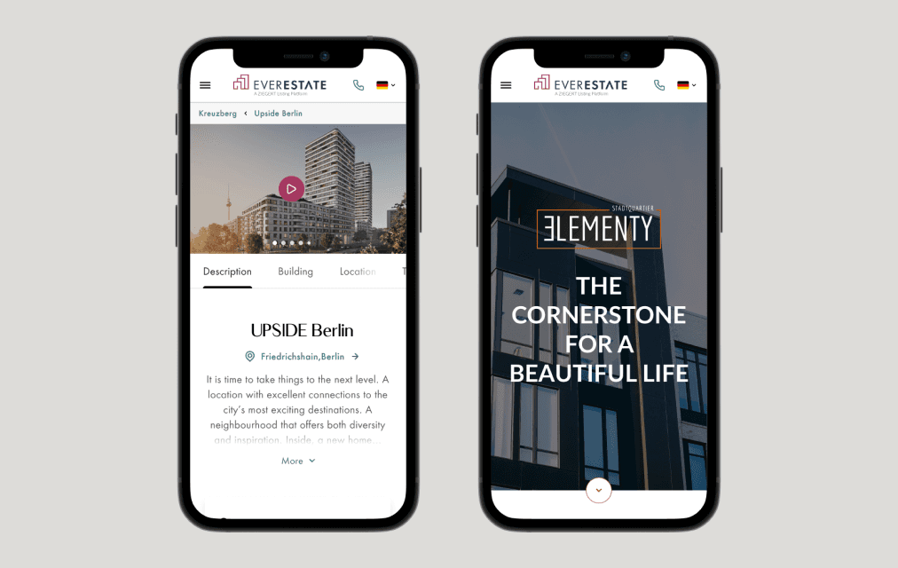
Our user base is almost evenly split between desktop and mobile users, necessitating a solution that caters to both. Tablet usage hovers between 0.2% to 1% monthly, suggesting limited investment in optimizing for this device.
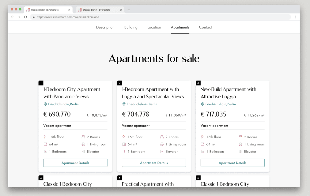
The conversion rate from the Project Page to the Unit Page stood at 1.2%. Identifying room for improvement in user experience, we explored enhancing this journey. Simultaneously, the engagement with filtering and sorting features on the unit list in the Branded Project Page sparked consideration for replicating these elements on the Default Project Page.


Company's archeology
Uncovering the past of legacy pages at Everestate, I navigated through the lack of documentation, recreated designs, and engaged stakeholders. Ultimately, fostering similarity between both project pages designs.
Working on legacy pages posed a challenge due to a lack of documentation. The original designer was no longer with the company, and only a few engineers remained from the legacy page team. No written documentation about the design decisions existed in our Confluence repository. Additionally, we lacked the original design files, and what we had was a recreated version in Figma by a colleague.
The product team, including myself, recognized the impracticality of maintaining Branded and Default Project pages with entirely different aesthetics, components, and design patterns. To address this, we needed to understand the historical reasons behind these choices and engage with stakeholders from various departments (marketing, sales, and operations).
Conversations with long-time engineers revealed that before the Branded Project Page, individual pages were designed, coded, and hosted for significant projects. The introduction of the Branded Project Page streamlined resources and traffic onto a single domain.
Consulting with the CTO, I unearthed old emails and presentation deck attachments that outlined the initial requirements for this page. It became clear that while customization for the Default Project Page content was essential, custom colors, typography, and components were not necessary.
Armed with this information, I initiated discussions with other stakeholders, discovering that they, too, believed in the importance of similarity between both project pages.
Triangulation
Combining user research, data analysis, and company history, I crafted assumptions for enhancing the project page, later prioritized with stakeholders.
Different sources of information and their methodologies always come with advantages and limitations. Therefore, I usually merge multiple inputs to view problems from diverse perspectives, enabling the formulation of preciser assumptions and hypotheses.
By combining insights from user research, data analysis, and the company's archeology, I compiled a list of assumptions for improving the project page. This list, documented in a Confluence page, and later prioritized in collaboration with stakeholders. Below, you'll find the assumptions we chose to explore in the final solution.
Assumptions on old design
Ideation

How might we make it easier for the users to get the information about the project they are looking for and later choose the perfect apartment for them?
Idea 1
Merge unit and project page, having all essencial information on the project page, and oly showing unit specif information in a new unit drawer.
By merging both pages we should have a more fluid experience and focus our optmization efforts in one single page.
Idea 2
Make branded an extend version of default project page, sharing components between both pages.
Optimize the first view port to have the most relevant information for the first scanning.
Change the way we show units for a list view, with filter and sorting, making it easier for the user to find and compare units.
Idea 3
Inspiration from car manufactores product configuration (specially Porsche and Tesla), allow the user to configure its unit.
Use progressive disclover to increate the feeling of agency, where we guide the user step by step in the process to find the perfect unit for him inside a project.
Prioritization
Idea 2 was the winner, but we also want to do more exploration on Idea 3 in the future.
We prioritized all ideas based on our level of confidence on what would have a higher contribuition to our OKRs vs effort to delivery and implement. The ideas was also prioritezed in relation to what we already had on our road map. In the end we decided that Idea 2 was the most promissing, but we also should do more exploration on idea 3 (soon I will post a case study about the experiment I created for that).

Idea 1
Idea 2
Idea 3
✅ Idea 2
By redesigning the first viewport we aim to organize and show all relevant information for the customer in an easy way, so they can decide if they want to invest their time further analyzing the project and its units. On the unit list, filtering, sorting, and pagination will help the user to find the perfect unit for his needs. This idea was also selected because there was no backend effort involved, and we already had components to filter and sort units on our catalog page, so it was considered a medium effort solution, from where we could further improve in the future.
Solution
Revamping the initial viewport simplifies information presentation, aiding users in deciding whether to delve deeper into a project. Unit list enhancements, like filtering and sorting, streamline user searches with moderate effort and room for future improvements.
Solution details
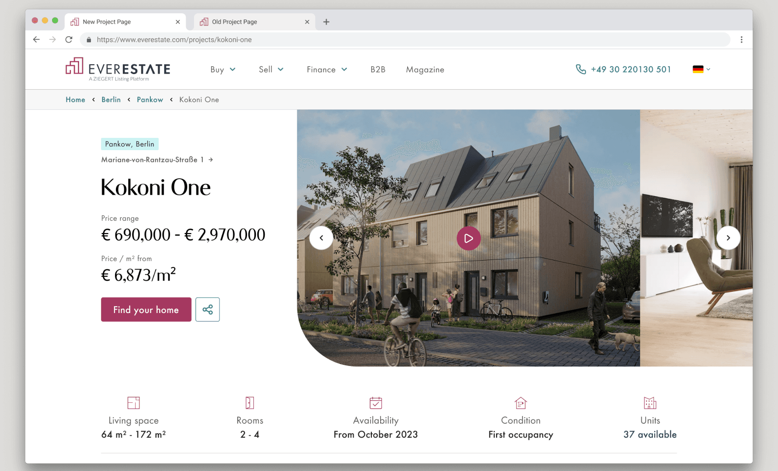
All relevant information in the first view port

Complete address linking to map
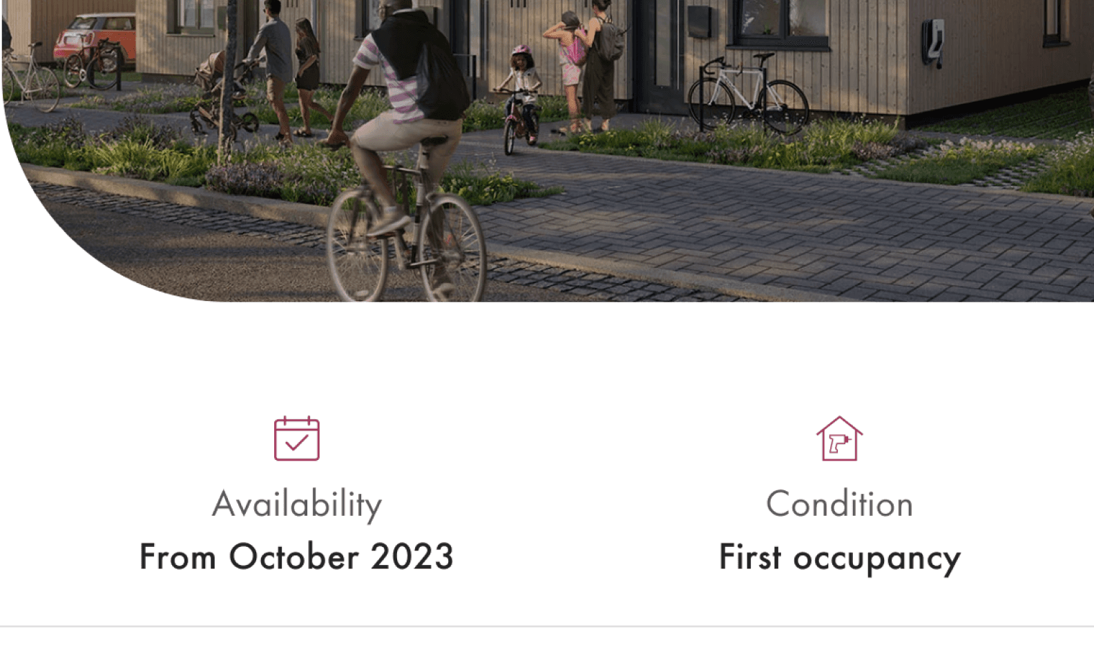
Added availability
and condition
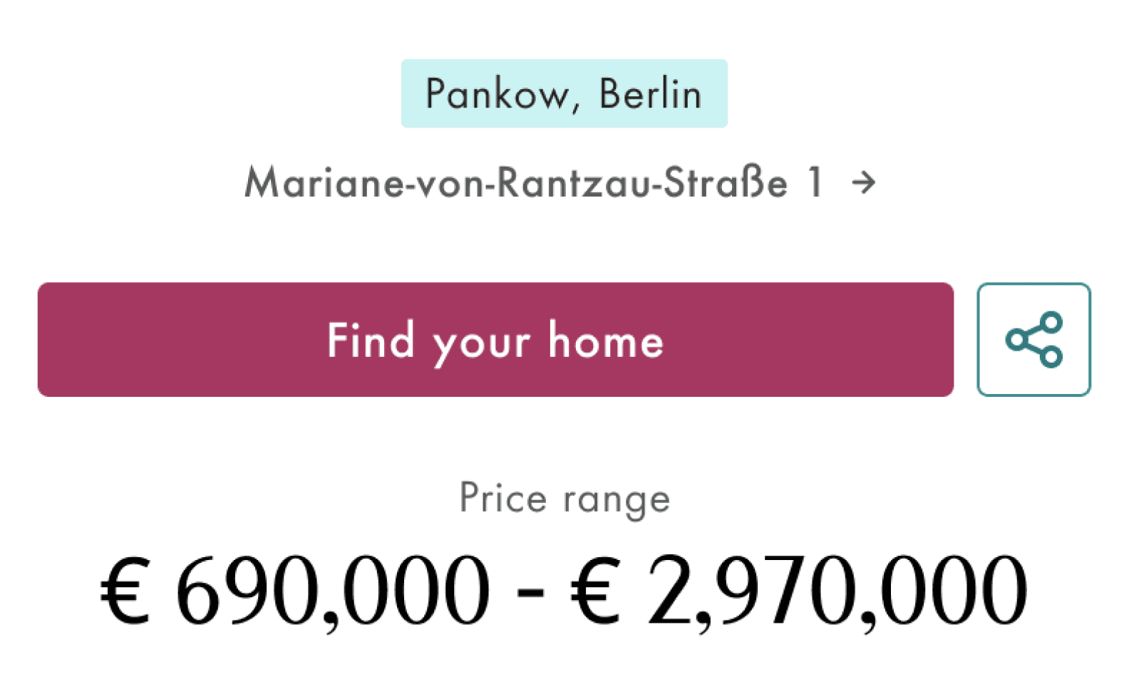
Link to unit list

More compact unit cards

Sorting on unit list
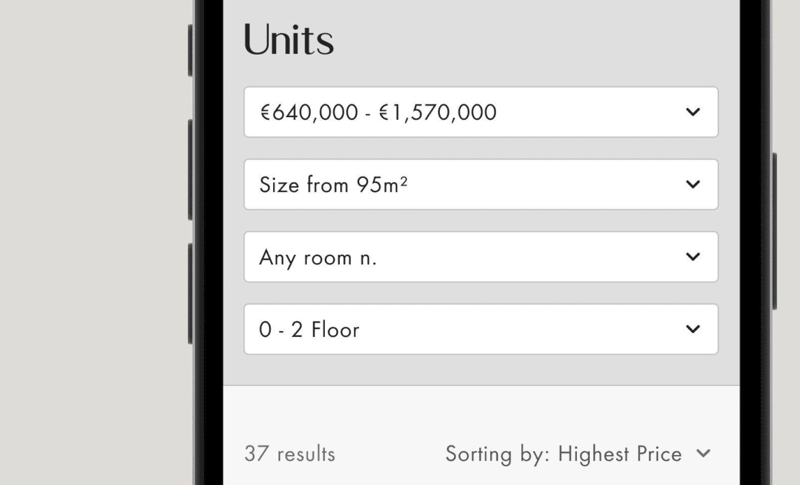
Filters on unit list
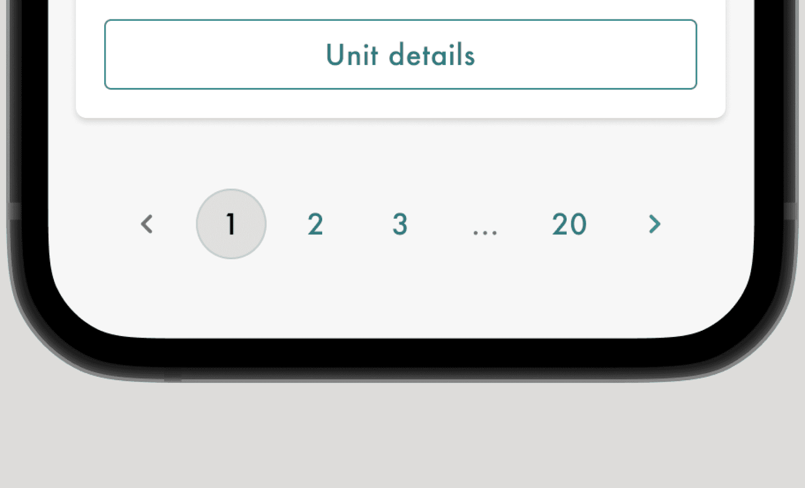
Pagination when showing more them 10 units
Testing
I crafted a prototype for user testing, aiming to assess filter and sorting usage, information adequacy, and overall design direction. Test results were positive, with a insight on the importance of availability dates.
After several rounds of stakeholder feedback, I created a prototype for user testing. The goals were to (1) assess users' use of filters and sorting, (2) ensure all necessary information was provided for users to decide on further inquiry, and (3) evaluate the direction of design changes. The overall test results were positive. Notably, the importance of availability dates, initially overlooked, surfaced during testing. Following discussions with the sales team, it became clear that these dates could vary among units in new buildings. Consequently, we added this information to the unit list.
Learnings


Results

Project's results were impressive, going over our expectations.
278%
CR from project to unit page increase
71%
Project page unique views increase
27%
Project page’s users engagement increase
52%
Avg. Session duration increase


